Fifty-two Tuesdays ago, I wrote my very first Above the Law article about how horrible PowerPoint is. I included a throwaway joke about PowerPoint being as horrible a presentation program as Excel is a drawing program.
While I still think PowerPoint is the absolute worst thing ever for trial presentations, I have changed my mind about Excel. It is now one of my favorite tools for creating litigation illustrations.
Out With the Old…

AI Is Reshaping Legal Practice—But Tools Aren’t The Real Differentiator.
Explore the mindset, cultural shifts, and training strategies that define the AI‑savvy lawyer, revealing why human judgment, standardized competence, and integrated learning—not technology alone—will shape the future of the profession.
Pie charts are good for visualizing the relationship between maybe 5 pieces of data (you can obviously do more than that, but not effectively on a pie chart). With bar graphs, you can show maybe 20 relationships. With scatter plots, maybe a couple hundred. Those are the charts that we learned in school and those are the charts that everyone knows how to make in Excel. They are also incredibly boring and overused.
…In With the New
Excel can do so much more than that though, and it’s not hard to learn at all. What if you’ve got a lot of data that you need to organize and visualize for a jury or a mediator or for a client? Excel has several new features for data visualization. One of them is called Power Map, a tool that takes lots of data and builds a 3D animated timeline with plot points on a map.
Here is a data set that Microsoft analyzed with Power Map. It’s a series of public data relating to Manhattan. It takes hundreds of years of data and quickly shows the viewer development of Manhattan and zoning information:

What Biglaw Can Learn From Personal Injury Firms
How a former insurance agent built a Houston injury practice around systems, empathy, and disciplined advocacy.
Using Power Map in Litigation
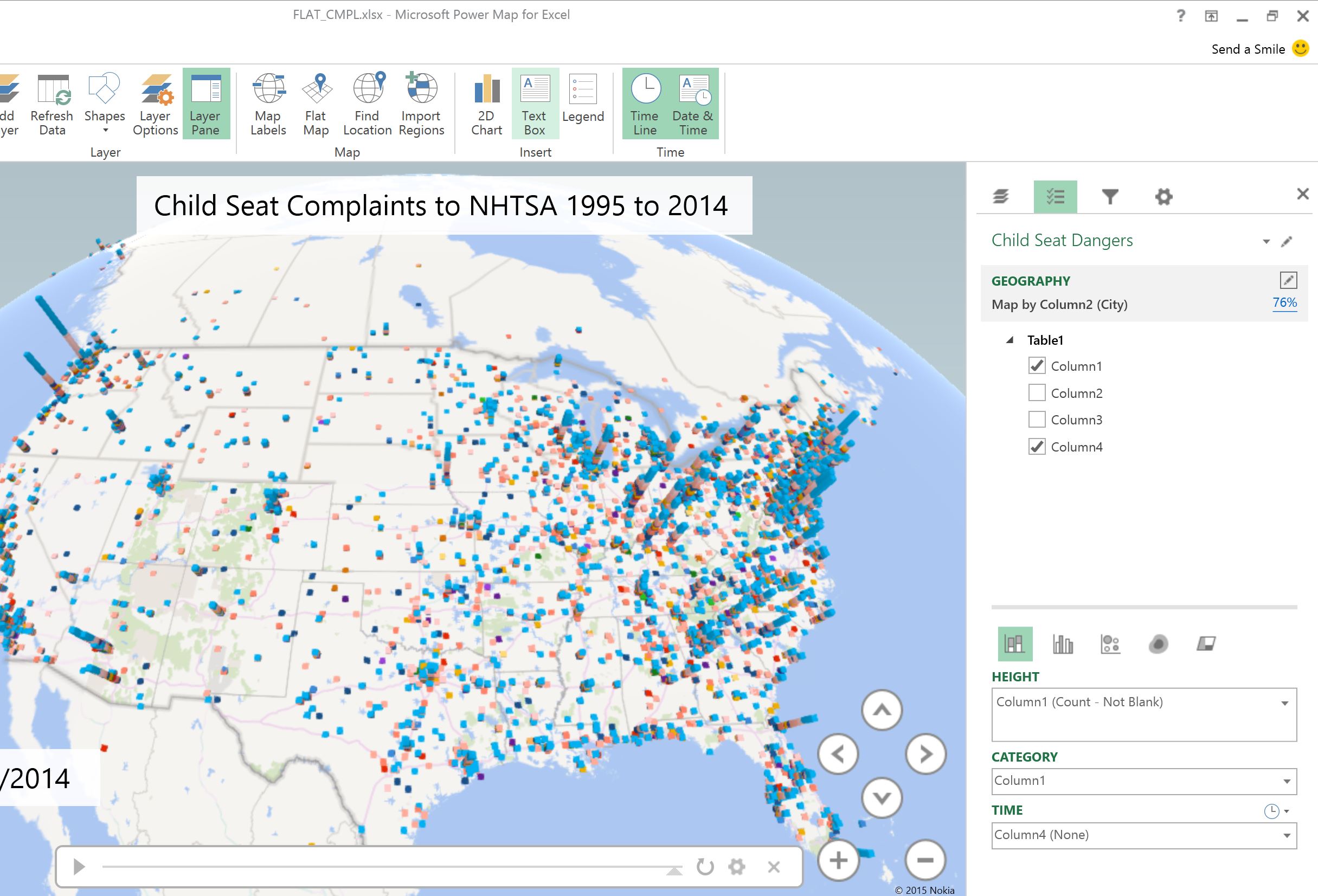
So, let’s explore the litigation uses of this tool. For this example, let’s assume that you have a products liability case involving a certain manufacturer of child restraint systems. You want to show the inherent danger of child restraint systems. If you are a boring human being, you will tally up those complaints from some public database and pat yourself on the back for a job well done. But if you like to communicate effectively with other human beings and need to present the information in a way that will make an impact or that will be remembered, you will go just a few steps further.
For this example, I have downloaded the zip file of the National Highway and Safety Administration’s complaint database from here. It’s a 174 mb text file. Opening it in Excel to organize the data into cells makes it about 750 mb of text. That’s about a million rows of data with several columns in each row. The first step is to get rid of the data you don’t need. We want to keep the column that has the complaint type, the date of complaint, and the location. We are left with almost 800,000 rows:
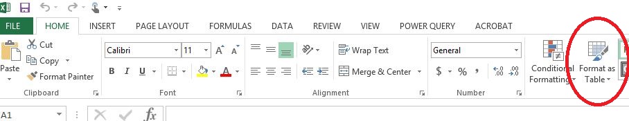
Next, I select the data and format it as a table using the “Format as a table” button on the Home ribbon:
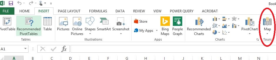
Next, I go to the Insert ribbon and select Map:
This opens up the Power Map menu and I select the column from my table that has the locations to be plotted, the data to be plotted (number of complaints), and the column for the date of each complaint.
That’s it. Now, I watch my animation. This is a 3D animated timeline, filtering through millions of cells of data to show complaints of child restraint systems to NHTSA over about 10 years:
This is just the Power Map tool. There are plenty of other Power tools in Excel for data visualization. More on that later.
Jeff Bennion is Of Counsel at Estey & Bomberger LLP, a plaintiffs’ law firm specializing in mass torts and catastrophic injuries. Although he serves on the Executive Committee for the State Bar of California’s Law Practice Management and Technology section, the thoughts and opinions in this column are his own and are not made on behalf of the State Bar of California. Follow him on Twitter here or on Facebook here, or contact him by e-mail at [email protected].