Ed. note: The original version of this article first appeared in 2015. But you’re still writing résumés so let’s revisit this subject.
Over the last few weeks, there’s been not one, not two, but at least six mainstream media articles about what font you “absolutely must use” on your résumé. Business News Daily, Bloomberg Business, Huffington Post, USA Today, NPR, even The Onion got in on this action. And it’s not like everyone suddenly had a typographic epiphany: each of these articles piggybacks off the one before it. It’s a frigging style-piece tsunami out there.
Why not get swept up in it too? Let the waves of modern journalism wash over us.
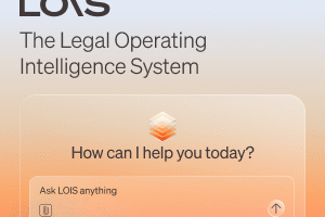
Filevine’s New Legal AI Platform LOIS Turns AI Into A True Legal Coworker
Legal work isn’t slowing down, and the firms that win won’t be the ones working harder — they’ll be the ones working smarter.
Do you think the font you choose for your résumé really matters? Meh, it probably does. Somewhere less than “having a T14 degree” and more than “the brand of your leather folio,” but it still probably matters a little — especially if you envision some sap pouring over thousands of résumés at once. But is that really how law firm hiring decisions get made? Even at on-campus interviewing I only ever had 10 or 11 meetings in a day. And when I stopped going on campus, I never looked at more than 2 or 3 at a time.
Ultimately, I can’t help but think The Onion’s coverage of this probably hits the nail on the head:
“Nothing says ‘I’m currently unemployed’ like a painstakingly selected font.”
But let’s indulge this call to adventure and check out some of the fonts recommended in these articles by using them in action by converting select sentences from an actual cover letter from a current candidate looking for a job — a former mid-level Biglaw associate, laid off during the recession:

Schenck Price Works Smarter with Lexis+ AI and Protégé
LexisNexis sat down with John Ursin, Managing Partner at Schenck Price, to learn how the firm is using legal AI to strengthen client service and daily legal work.
Times New Roman — Hurray! You have Microsoft Word! Good for you. Hell, even Microsoft Word stopped using Times New Roman as the default, that’s how much it sucks. And yet here it is on the recommended list. Actually, this was the most controversial selection to come out of these articles. Some of the experts polled for the litany of articles described the venerable standby as a safe option. Others described it as lazy. Indeed, one creative director said, “It’s like putting on sweatpants.” This isn’t a new opinion in these pages.
On the other hand, the legal industry isn’t filled with people who respect rocking the boat. While it’s not true that every court expects submissions in boring, old Times New Roman, most still put it on a very limited list of acceptable options. So when you’re writing up your résumé, do you want to convey to your future Biglaw masters that you’re “boring/traditional” or “bold/rebellious”? Because it’s going to be hard to thread that needle. Thankfully, some fonts exist that get you there.
Trebuchet — Like this one, if you’re not into the whole “flowery serifs” thing. Personally, I like a mild serif because it makes it look like something’s actually happening on the page. If letters get too minimalist, the document starts to look more like some utilitarian sign pointing you to the nearest dog run than a document with a human face behind it. Trebuchet is just about as minimalist as one can get before some funky effects start infecting your résumé.
Helvetica — Like with this font. Bloomberg Business chose Helvetica as the best possible font for job-seekers. I call bulls**t. Not that it didn’t make for an interesting movie (affiliate link), but the point of the documentary was how much everyone hates the ubiquitous, blocky, space-guzzling typeface. At one point in the film, it’s described as “fascist.” How a font that attracts that much ire ever made it onto any list of recommendations boggles the mind. If you’re writing a subway sign, use Helvetica. That said, this is the same reporter who published the Five Charts That Show You Should Apply To Law School This Year, so she may be suffering through a concussion.
If you’re writing a résumé — or God help you a brief — use something else.
Arial — Business News Daily suggested Arial, which is just a knockoff of Helvetica. The lesson here is that Business News Daily is too cheap to have the original Helvetica on their computers.
Calibri — Finally, a suggestion that won’t chew up the entire page. It’s clear and legible. A little boring though. It’s almost too minimalist, which can bite you in the ass when you try to describe your work experience and it barely fills a line and a half. There’s definitely a Goldilocks effect here: Helvetica looks like you’re trying to snowball them by padding out every word, while Calibri looks like you sketched your first draft on a Post-It note.
Garamond — For my money, this is the Baby Bear’s porridge. There are serifs that make it look like something interesting is actually happening on the page, but it’s not as flourished and played out as Times New Roman. This was the choice of The Onion too:
“Garamond it is. Glad I never have to think about this ever again.”
Comic Sans — Everyone agreed that unless you’re expressing your frustration with LeBron James, you don’t use Comic Sans.
And once again, Wingdings is overlooked.
The Best Fonts to Use on Your Resume [Business News Daily]
The Best and Worst Fonts to Use on Your Résumé [Bloomberg Business]
Typography Expert: Times New Roman Bad Choice For Résumé [The Onion]
Times New Roman, Dubbed The ‘Sweatpants’ Of Fonts, Is A Bad Choice For Résumés: Typography Experts [Huffington Post]
Earlier: Small Firms, Big Lawyers: The Perfect Font … To Show You Don’t Care