 About a year ago, I made a YouTube video on how to create pleadings from scratch and mentioned in one of my other articles earlier this year. No one really ever needs to create a pleading from scratch, but understanding the elements behind how each part is created can help you troubleshoot any formatting problem you have. Since I published that video, I’ve received a lot of questions, so I figured I’d follow up with some more hints on how to make pleadings look perfect. You’re on your own for content though.
The Key to Perfect Pleadings is Spacing
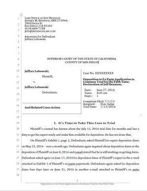
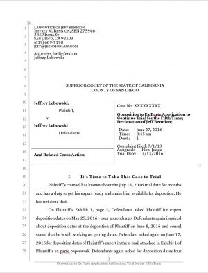
Knowing how to control the horizontal spacing of words and the vertical spacing of words is crucial for good looking pleadings. The first thing you’ll want to do is to check your margins. If they are set as far out to the edges, you are doing it wrong. Look at this before and after:

[BLOG] AI-Enabled Marketing: Your Secret Weapon for Growing Your Legal Practice
Drowning in marketing to-dos? Learn how firms use AI—the right way—to build lead magnets, rank in AI search, turn referrals into revenue, and craft data-driven business plans.
Text pushed out as close to the edges as possible:
Text with wider margins:

Why Law Firms Are Moving Beyond The Billable Hour
Explore 5 expert-backed reasons law firms are rethinking the billable hour and how legal billing software is leading the way.
The whole purpose of margins is to make the document look more readable. While you might be able to gleefully read through your motion quickly, if you are a judge with 1,500 cases and you are trying to read and analyze as many motions as possible, readability is really important. Having ugly margins doesn’t make your document illegible, it just makes it so the brain has to work a little bit harder to read it. It’s like the difference between running in compression shorts and running in Levis. Take a closer look at the margins:
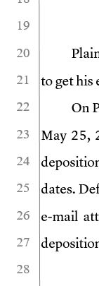
Matthew Butterick, author of Typography for Lawyers (affiliate link), discussed this concept in detail in his book. Lots of studies have been done about how having narrower columns of text increases the readability. That’s why when you open up a print version of a newspaper, they don’t just have one line of text span all the way across the page. They break it up into narrow columns because science shows that that makes things easier to read. Take a look at his page on formatting pleadings here for more on the topic. It’s especially troublesome when you have a line on the sides of your pleadings. Mashing your text up against vertical lines makes your brain work a little bit harder to recognize the characters as words.
Next, you’ll want to make sure your text lines up with the numbers at the side. On the caption page, you can get the first line of text to line up by dragging the bottom of the caption box up or down to push or pull that first line to a line with numbers.
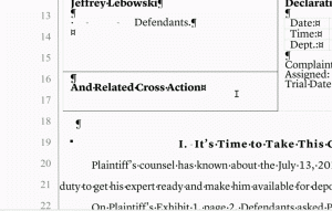
From there, you just have to make sure that your body text matches the same line spacing options as the spacing options for those numbers. Double click on the very top or bottom of the page to get into header/footer mode and highlight the numbers on the left. Now, go into the line spacing options on the toolbar under the Paragraph tab and select Line Spacing Options. At the bottom of that window, you’ll have options to control the line spacing. I always use 0 points before paragraph, 0 points after, check to not add extra spaces between paragraphs, and set my spacing to exactly 24 pt font. When you are in the options, note what the spacing options are of the numbers, then go back into the body of the document and highlight all of the text and change the line spacing options to match whatever you had with the line spacing options for the numbers. If the starting point of your body text lines up with the numbers and the spacing of the numbers and your body text are the same, everything will line up.
How to Regain Control after a Block Quote
If you are typing a motion with double-spaced text, then you have a single-lined block quote, your text might not lie up after the block quote. To fix this, simply put in an extra space after the block quote. Then, click on that blank line and change the font size of the that blank line to push or pull the text underneath it. For example, if you click on a blank line and change the font size of the blank line from a 12 to a 4, you will bring up the text underneath it by about a tenth of an inch. Play with the font size of that blank line until the text underneath it matches the numbers again.
Tips for Working in Tables
If you hit the space bar a bunch of times to make text line up horizontally with other text below or above it, you are a horrible person. Don’t do this:
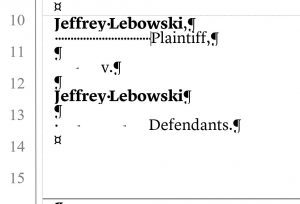
A better way is to use tabs or the ruler tool:
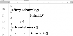
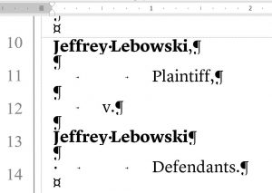
When you are working in tables, however, pressing the tab key will jump you to the next cell. If you hold down CTRL+Tab, you can add tabs in table cells:
The look of your pleading is usually the first impression your argument gets to make on a judge. Having an attractive pleading is very important because it shows the judge that you did not race the preparation of this document, and that you have an attention to detail. Those are good first impressions to make.
Jeff Bennion is Of Counsel at Estey & Bomberger LLP, a plaintiffs’ law firm specializing in mass torts and catastrophic injuries. He serves as a member of the Board of Directors of San Diego’s plaintiffs’ trial lawyers association, Consumer Attorneys of San Diego. He is also the Education Chair and Executive Committee member of the State Bar of California’s Law Practice Management and Technologysection. He is a member of the Advisory Council and instructor at UCSD’s Litigation Technology Management program. His opinions are his own. Follow him on Twitter here or on Facebook here, or contact him by email at [email protected].