(Photo by Chip Somodevilla/Getty Images)
A firm’s logo is often a client’s first real contact with an attorney. Whether it’s on a billboard or a website or on the business card the lawyer handed a prospective client, the logo tells a client something about the attorney. Aesthetics matter and a professional logo communicates to the viewer that the attorney takes the business seriously enough to spend the time and resources to appreciate graphic design. The alternative is not great and can prove very bad for business.
In between working hard to keep the former president out of the grand jury room, Donald Trump’s newest lawyer Joe Tacopina has to put himself out there for other business. He’s got a nice, slick website design with a professional logo.
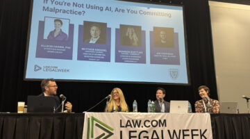
What Even Is AI ‘Competence’? It Depends.
Takeaways from a Legalweek panel on evolving malpractice risks.

Classy.
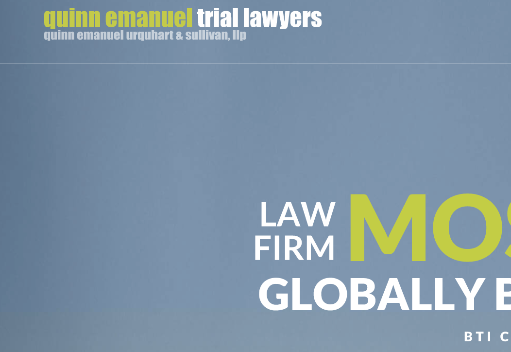
There’s a pop of color with that green and white scheme that draws the viewer in. Most law firms stick with boring, conservative black, gray, and white, making this stand out in a positive way. The lettering combines a clean, compact font and lower-case lettering to convey a modern outlook. People overlook the importance of an aesthetically pleasing font, but there’s a reason no one is submitting resumes to firms in Comic Sans.
The coloring and lettering gives off an almost West Coast feel for the New York firm, doesn’t it?
The New Way Litigators Handle Depositions Applies AI Every Step Of The Way
Depositions by Filevine help with scheduling, tracking goals, and trial prep.
Oh no.
Yes, it appears as though Tacopina deploys the same logo design as Quinn Emanuel. Well, not exactly. Quinn green is a little darker than Tacopina green. Is Tacopina going for the Jets uniform vibe, perhaps? If so, consider this the butt fumble of firm branding.
Even the under-logo featuring the full name of the firm seems like a copy. Tacopina’s firm uses all caps and Quinn stays in lower-case, but conceptually it’s the same.
Presumably, Tacopina and his team didn’t intend to do this. Some designer probably grabbed something that looked “lawyerish” and slapped it on there. Or maybe Quinn hired someone who did the same to Tacopina’s website. Either way. To borrow from one of the best SNL bits of the last several years:
Yeah, he just highlighted the firm name, he clicked the drop down menu, and the he randomly selected Impact Bold and colored the first half green. Like a thoughtless child wandering through a garden yanking leaves along the way.
Maybe Tacopina is waiting for those Trump fees to start rolling in so he can hire a graphic designer to revamp the look. If that’s the plan, he may want to check in with Rudy, because sometimes those bills don’t get paid.
Earlier: Biglaw Firm Rebrands, And The New Logo Is… Let’s Just Say ‘Unconventional’
What Font Should You Use For Your Résumé? Apparently This Matters To People.
 Joe Patrice is a senior editor at Above the Law and co-host of Thinking Like A Lawyer. Feel free to email any tips, questions, or comments. Follow him on Twitter if you’re interested in law, politics, and a healthy dose of college sports news. Joe also serves as a Managing Director at RPN Executive Search.