 It’s 2016, so I’ll skip the intro and assume you understand that a firm’s website is important. The online representation of your brand is relevant for clients and potential clients, recruitment, and the overall reputation of the firm. But getting the perfect website, isn’t as easy as just wishing one into existence.
At the Legal Marketing Association’s annual conference this week, there were plenty of opportunities to learn about the value of a kickass website. And not a moment too soon, as it seems a lot of firms are undergoing a website redesign.
Content boosting brand. Show of hands of folks doing website redesign – a forest of hands shoots up in audience #LMA16
— Oliver Thoenen (@jathoenen) April 12, 2016

AI Built for Litigation. Verified by Design.
Grounded in authoritative content and verified at every step, Protégé is the only legal AI tool that delivers work you can trust—without exception.
As you might imagine, there are tricks to ensuring you have an effective website, the kind of clear, concise tool that communicates the value of the firm’s services.
Write clear, concise website and brochure content that says what you do and your value add. #LMA16 #content pic.twitter.com/hd36xNwk5U
— Danielle Diforio (@ddiforio) April 12, 2016

Learning After Law School
Once you’ve got your law degree, how do you keep your professional skills up to date? Share your perspective in this brief survey, and you may be eligible to win a $250 gift card.
And you’d best make sure you get it right because you only have 50 milliseconds to make a good impression.
It takes 50 milliseconds to process how they feel about your website. Design has to be easy to understand and digest. @TomShapiro #lma16
— Audrea Fink (@AudreaFink) April 12, 2016
Amidst all the redesign going on in the industry, it makes sense that not every firm would hit it out of the park. But one Biglaw firm recently hit the reset button on their online presence, and not everyone is happy. We received this complaint from a tipster:
Cleary Gottlieb inexplicably redesigned their previously elegant website to what can only be described as what-the-actual-f**k? It looks like an ADHD 10-year-old kid from 1995 designed the layout on his $24.95 per/month AOL subscription. As an incoming associate, I am now afraid to tell people which firm I am going to for fear that they may Google them and see this nonsense. I am going to start a petition at change.org, please join me!
Why don’t you tell us how you really feel, buddy? And I’m not so sure a 48.8Kb/s dial-up connection could handle the flashy graphics. So what’s the big redo that’s creating buzz? Well, here is the site:
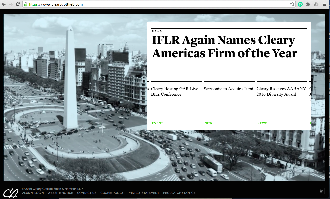
The still image doesn’t reflect the rotating images on the homepage, which can be annoying. Besides that, the branding seems a little understated, and when you click on the attorney bios, the pictures seem quite a bit bigger than the understated square that white-shoe firms usually use. Not my favorite website, but I don’t think it signals the end of times like our tipster does.
So, who’s right? Here is your chance to let the Biglaw firm know what you really think.
[poll id=”554″]
Kathryn Rubino is an editor at Above the Law. Feel free to email her with any tips, questions, or comments and follow her on Twitter (@Kathryn1).